All new launches of H. Moser & Cie. at the Watches & Wonders 2021 embody the daring concept of removing the branding from the watch face and playing with the distinctive design codes instead. Follow our super-subjective thoughts on the new releases.
I’m not a watch journalist or a journalist at all – I don’t like to write articles and I’m not particularly good at it. I’m an economist, a marketing and communication professional who happens to love fine watchmaking, high jewellery and art. Nevertheless having written articles on our site for so many years must say something about my appreciation for these genres.
I can’t help but to always look at all the watch events, the online (and in-person) presentations of the CEOs and CMOs, the brand strategies and the ads from a markcom perspective: how clear the messages are, how credible do they sound and how could customers interpret them? How would I do it? I also like to guess the topic or the main points of a presentation beforehand in order to see which companies are on a similar mind-track, and who can stand out and why.
H.Moser & Cie at Watches & Wonders 2021
In the case of H.Moser & Cie I’m rarely disappointed. With the engagement of the MELB Holding and the Meylan family the branding messages have been rather clear. Edouard Meylan was appointed as CEO of Moser Watch Holding in 2013 and since then he and his team had a few unorthodox and outstanding moves.
You might like these or not, but Moser has gradually and consciously shaped its image in the past 9 years. Arriving to the end of his first decade at Moser, Edouard Meylan decided to focus the 2021 novelties on his brand’s defining signature: minimalism. He used WW21 to strengthen this image by sharing his beliefs and goals with regard to branding Moser at a dedicated session, entitled ‘Erase the Brand to Sublimate the Creation’.
He started his presentation with the history of branding. Its origins depend on your definition of what a brand is, but some evidence from ancient civilisations can easily fall under this concept: craftsmen put seals onto their tools, and merchants used signs for their own products as well.
The word ‘brand’ is derived from the Old Norse (classical North Germanic language used from roughly 1150 to 1350) word, which means ‘to burn’. Originally, a brand was a burning piece of wood and later described a torch. By the 1500s, it became common to brand cattle in order to show ownership. In the late 18th century, the birth of the Industrial Revolution changed how products were made and branded. In 1870 it became possible to register a trademark – this handles branding as intellectual property, giving a way for companies to officially claim their products and fight counterfeiting. The 20th century saw the birth of several iconic companies and logos – many of them are still around – Ford, Chanel or Coca-Cola just to name a few. The 1960’s through the late 1980’s have been characterised as the ‘Golden Age of Advertising’. If you are a fan of the era, I recommend checking out the albums of Taschen, like the ‘Golden Age of Advertising 50’s,’ 60’s and 70’s or ‘The History of Graphic Design’. From 2000 onwards branding has been becoming more and more complex and the customers of today are more educated and well informed than ever before.
With genuine ideas and systematic image building, some companies managed to give products an added meaning and encompass emotion in shapes, logos and colours. Some products are recognised anywhere in the world just by their silhouette to the extent that you don’t even need to put a logo on.
This is the ultimate goal of Edouard Meylan: to make Moser timepieces unmistakably recognisable even if the logo is removed, while constantly pursuing new ideas – design gags like the Swiss Alp Watch, new shapes like the Streamliner, extreme minimalism such as the Swiss Alp Watch Concept Black and new collaborations such as the one with MB&F or this year’s Endeavour Centre Seconds Concept x seconde/seconde with Romaric André.
If you had any doubts why Moser does what it does, his direct and energetic presentation have definitely dispelled it all.
H.Moser & Cie. Concept watches and latest novelties
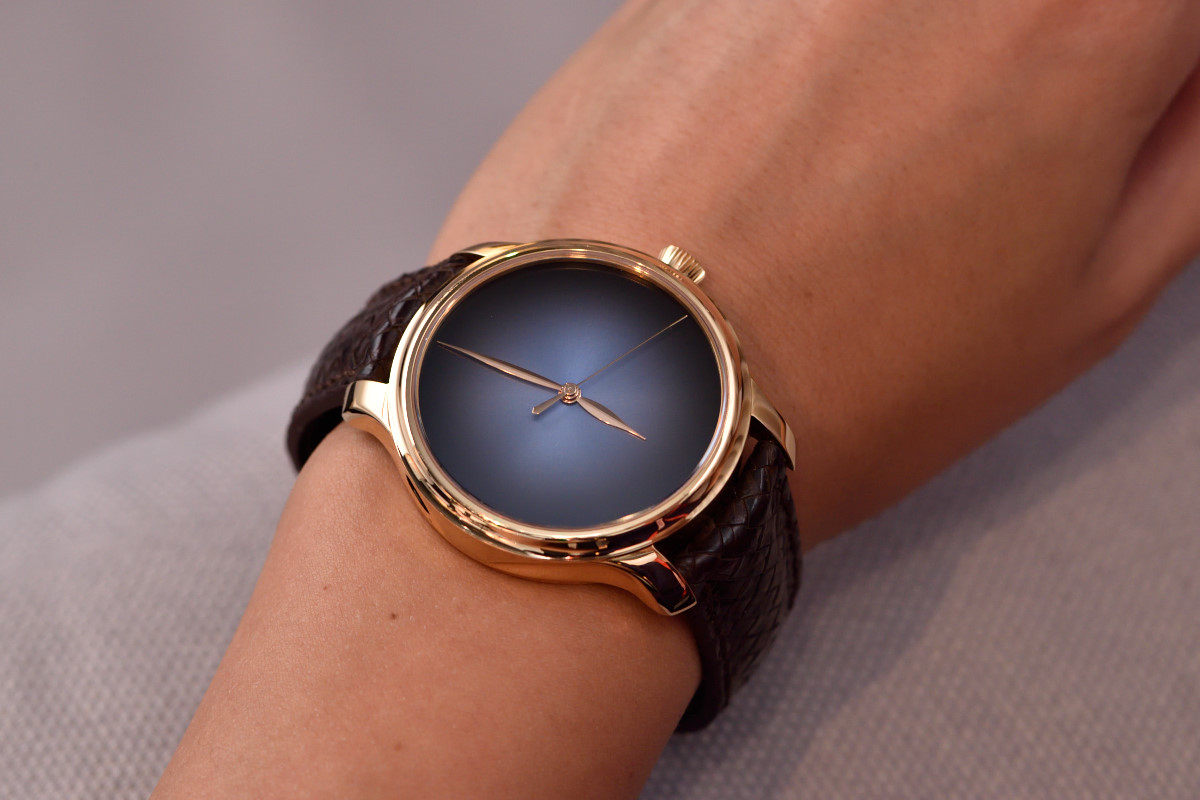
I have an enduring platonic love with H. Moser & Cie. Concept Watches, like the Endeavour Centre Seconds Concept from back in 2015. Clean from even the smallest excess additions, I see these as the epitome of refined luxury. All you have is a great caliber ticking inside, outstanding proportions and beautiful finishing on high-grade materials. No numerals, no logo, no heavy decorations. You need a healthy dose of self-confidence and nonchalant elegance to wear something like this – it is a message from connoisseur to connoisseur.
But this is true also for the company – as Edouard explained, it took years of hard work until they allowed themselves to let their strong package of design, colours and technicality be their trademark instead of a shiny logo.
As a niche brand, they accepted a possibly smaller but a definitely more zealous fan-club, who do look beyond the obvious and actually search for individuality.
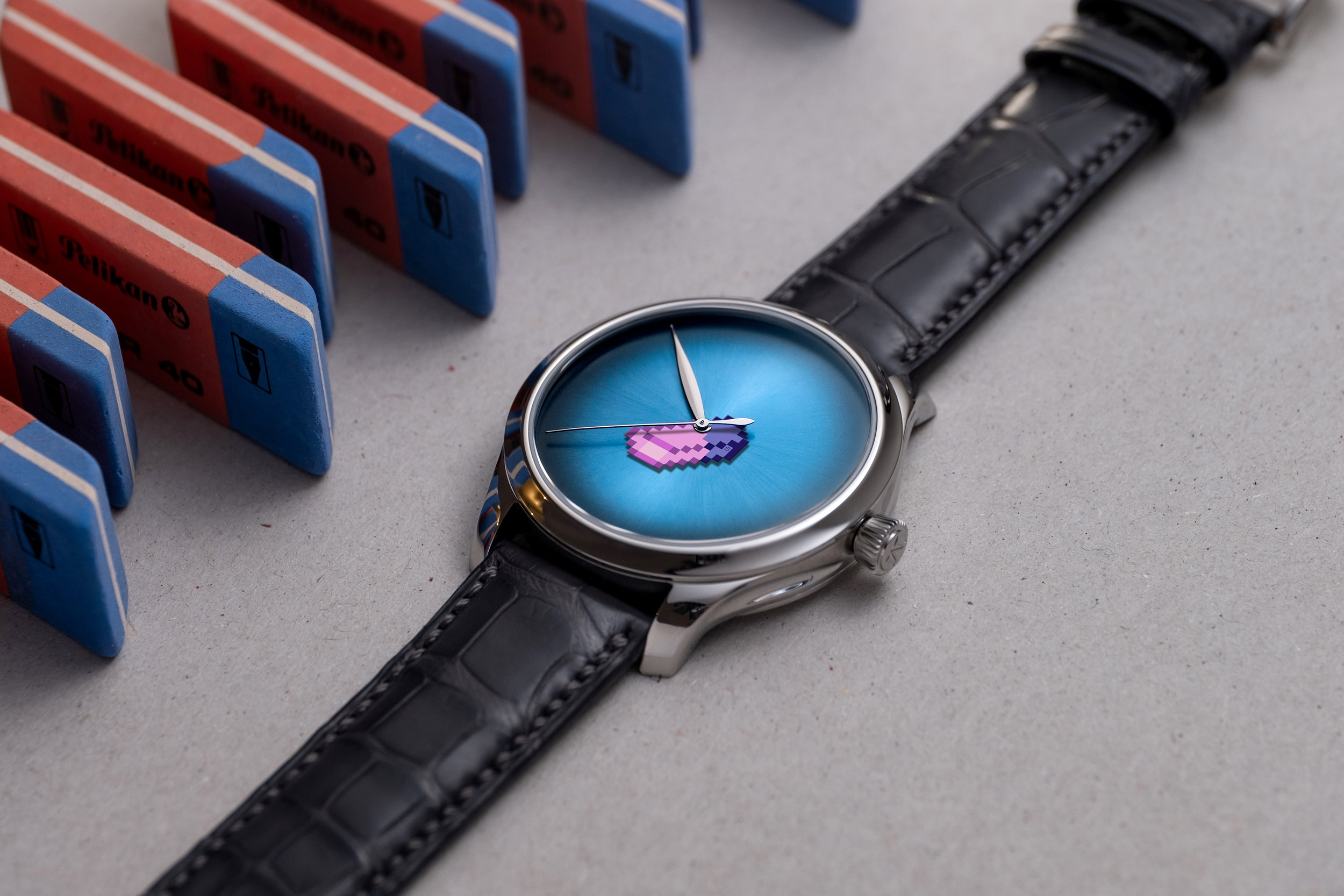
Endeavour Centre Seconds Concept x seconde/seconde
To illustrate the above mentioned approach, H. Moser & Cie. wanted to collaborate with Romaric André, the founder of France-based seconde/seconde/, who ‘just plays with hands on vintage watches’. This is how a vividly coloured pixelated eraser replaced the traditional hand. The logo has obviously been erased to fully reveal the creation.

As he explains his philosophy: ‘The “hand swap” – this principle designed to switch one or more hands on an existing watch – has become my signature and, for me, it is driven by a latent disrespect impulse. I want to upset the balance. Create disharmony. This dissonance is my way of disorienting the product, deconstructing it. So that I can then reconstruct it. To reveal an unknown facet or show another perspective. My perspective. The eraser, I see it as a banal everyday object which is taking power over the prestigious, exceptional object. It is a metaphor for removal and for minimalism – notions clearly dear to H. Moser – but also a metaphor for that constant striving effort, for these fruitless attempts, often hidden from view, that we erase a thousand times before solving the equation, before successfully completing this work. To sometimes find what you seek, you must constantly make mistakes, and erase’.
The Endeavour Centre Seconds Concept X seconde/seconde/ model is released in a limited edition of 20 pieces, and will only be available on the H. Moser & Cie. website. Each piece will be accompanied by an exclusive numbered work by seconde/seconde/.

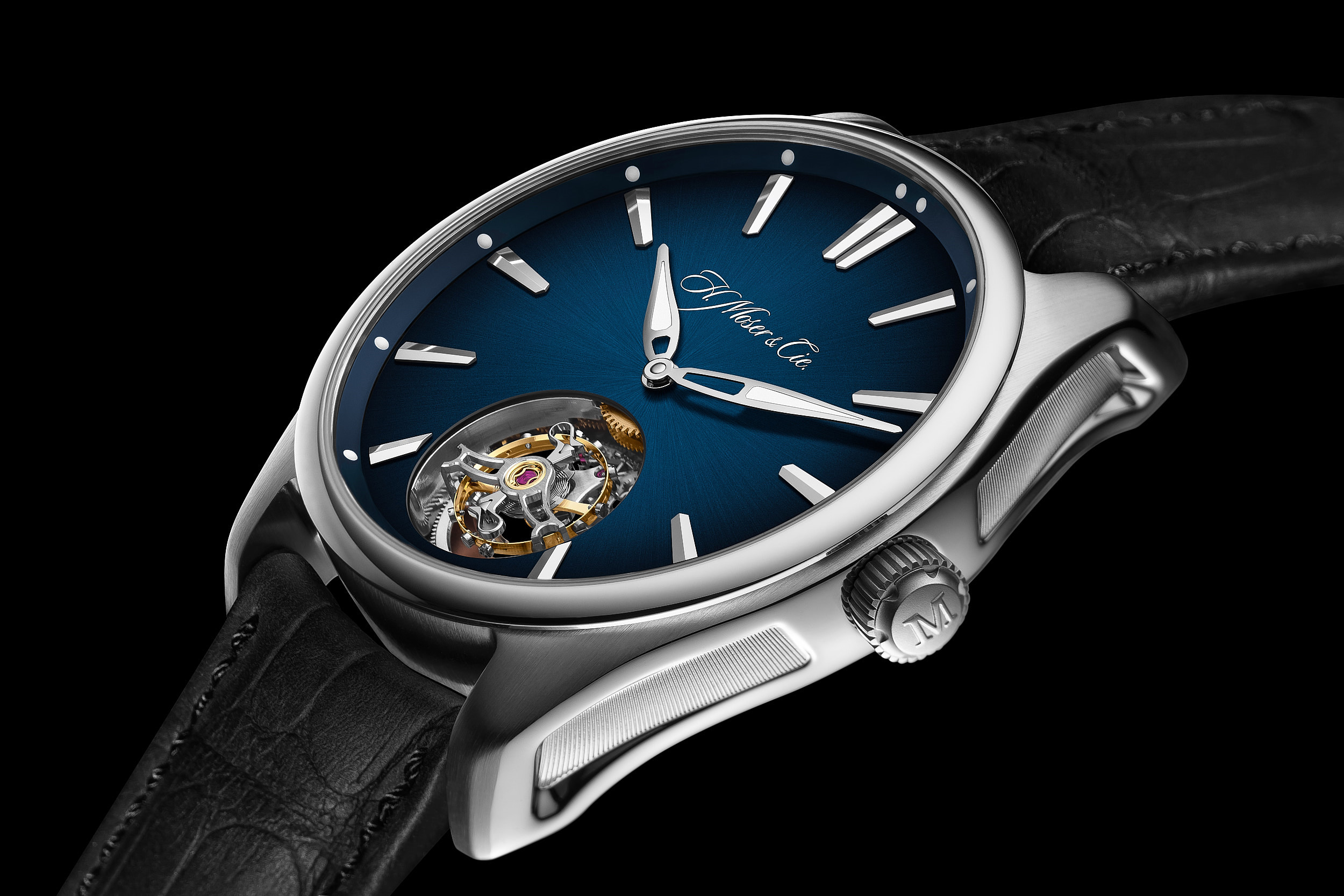
Endeavour Tourbillon Concept Tiger’s Eye
Another, very elegant interpretation of the ‘no logo’ concept is the Endeavour Tourbillon Concept Tiger’s Eye. It features a beautiful, semi-precious stone (a certain type of microcrystalline quartz). Tiger’s Eye – with its mysterious name and mesmerising colours – comes in many different varieties, ranging in colour from grey-blue to golden brown and reddish brown.
The artisans at Moser choose two colours: in blue with the Falcon’s Eye natural stone dial on a white gold case and in reddish brown, with the Ox’s Eye natural stone dial on a red gold case. You find only an aperture at 6 o’clock on the watch face to magnify the one-minute flying tourbillon. Both versions are limited to 50 timepieces.


Pioneer Centre Seconds MEGA Cool
Currently all of us need something very bright for our future and H. Moser just delivered it. The Pioneer Centre Seconds MEGA Cool has the stated intention to put a smile on your face – and a mega cool watch on your wrist, of course.
The watch has a 42.8mm steel case water-resistant to 12 ATM, it is graced with the Blue Lagoon fumé dial, in shades of turquoise evoking the waters of the most amazing tropical vacations of your dreams. Its anthracite grey faceted applique indices topped with Super-LumiNova® markers, the Pioneer MEGA Cool has three-dimensional hands made from two sections, overlaid with strips of Globolight®, an innovative ceramic-based material which contains Super-LumiNova®.
Again, the dial features a stylish way of branding – a transparent lacquer H. Moser & Cie. logo, affixed at 12 o’clock, but you can see it only in a certain angle.
For hardcore fine-watchmaking lovers the company created a Pioneer Tourbillon version, a limited edition of 50 pieces.


Photo credits: H.Moser & Cie.
All registered trademarks are property of their respective owners.
All rights reserved.