I consider myself a visual freak. I love art, paintings, sculptures, design and other beautiful things around me, including eye-catching logos and typography. Many people are familiar with the works of Philippe Apeloig (he is a graphic designer born in Paris in 1962). A great amount of his work is related to the arts and to cultural affairs; for example he designed the logo of the Petit Palais, the City of Paris Fine Arts Museum, posters for Théâtre du Châtelet, the logo for Louvre Abu Dhabi (a planned museum, to be located in Abu Dhabi, UAE), and posters for exhibitions such as “Yves Saint Laurent” or Cézanne.
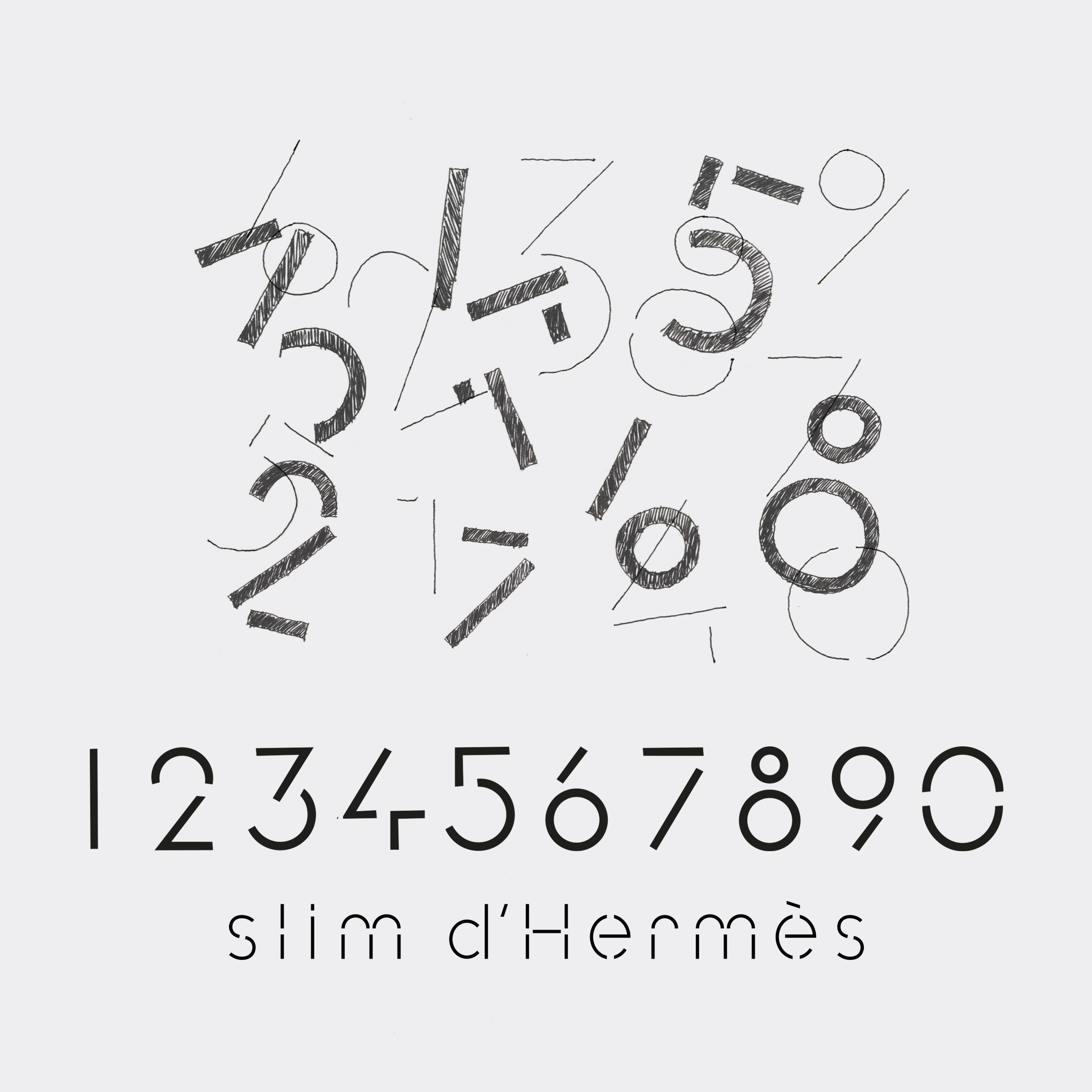
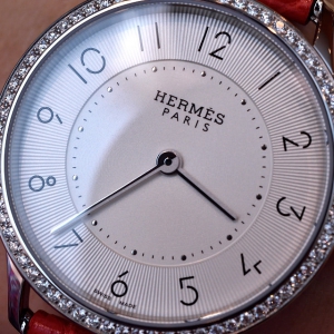
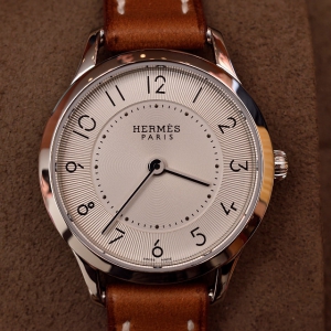
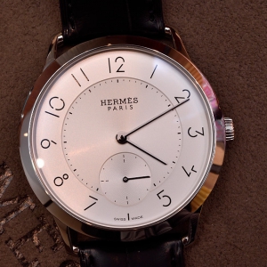
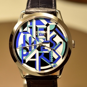
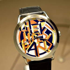
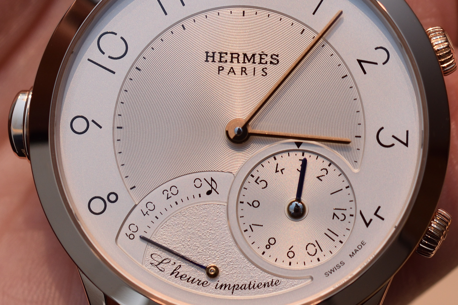
In 2013 he designed the visuals of the Saut Hermès equestrian competition. The poster depicts expressive typography that draws jumping white letters on Hermès orange, the brand colour and the letters are interwoven with a set of black lines forming a tapered drawing of a rider on a horse race. Perhaps this impressive cooperation led to the next level; Apeloig created the typography of the hour-markers on the new Slim d’Hermès series. The numbers are a perfect match for the watch design, made by Philippe Delhotal, Creative Director of La Montre Hermès.
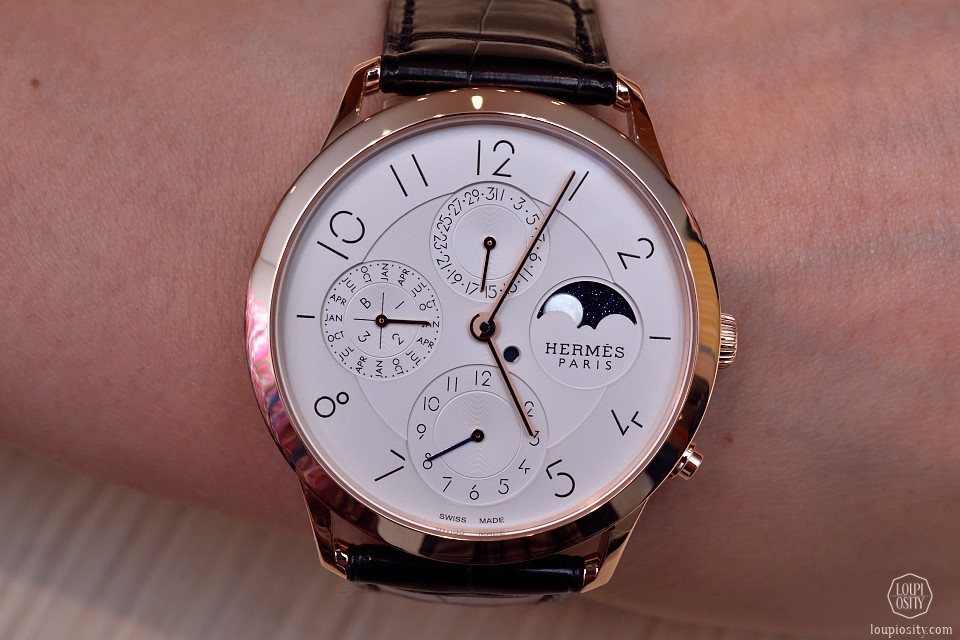
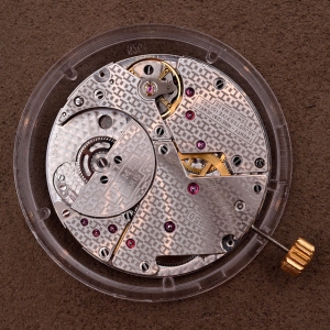
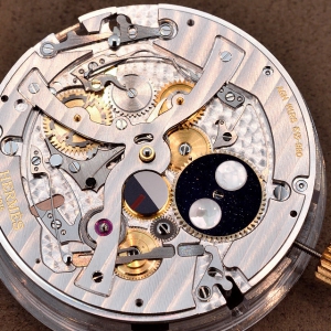
The 39.5 mm-diameter model houses a Manufacture Hermès H1950 ultra-thin movement. In this size there is also a perpetual calendar version, with moon-phase indication in natural white mother-of-pearl set against an aventurine glass sky, as well as a dual-time display.
The smaller timepieces are equipped with quartz movement, and offer a great selection of colours and materials: blackcurrant, cloud white and sapphire blue, ember, Etruscan, elephant grey and ultraviolet options. The wristband is also available in box calf, Barenia leather strap or steel bracelet versions, the cases have rose gold or steel variations, with or without diamond settings.
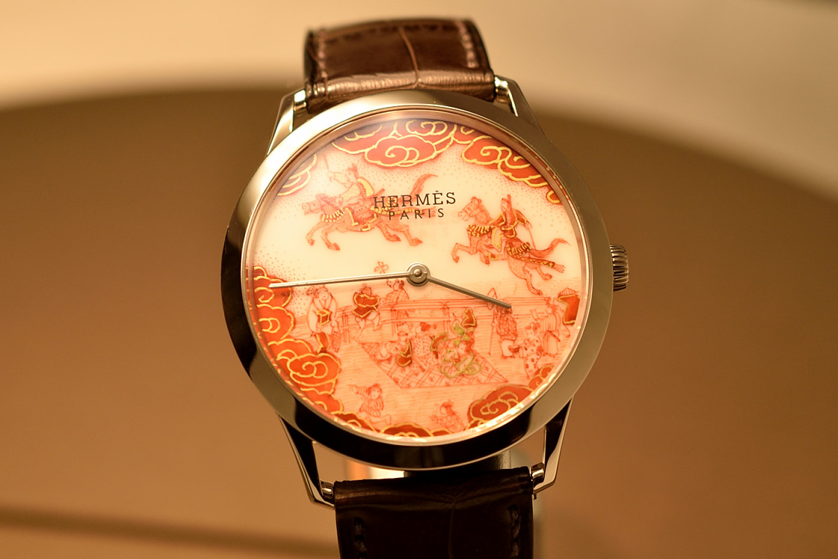
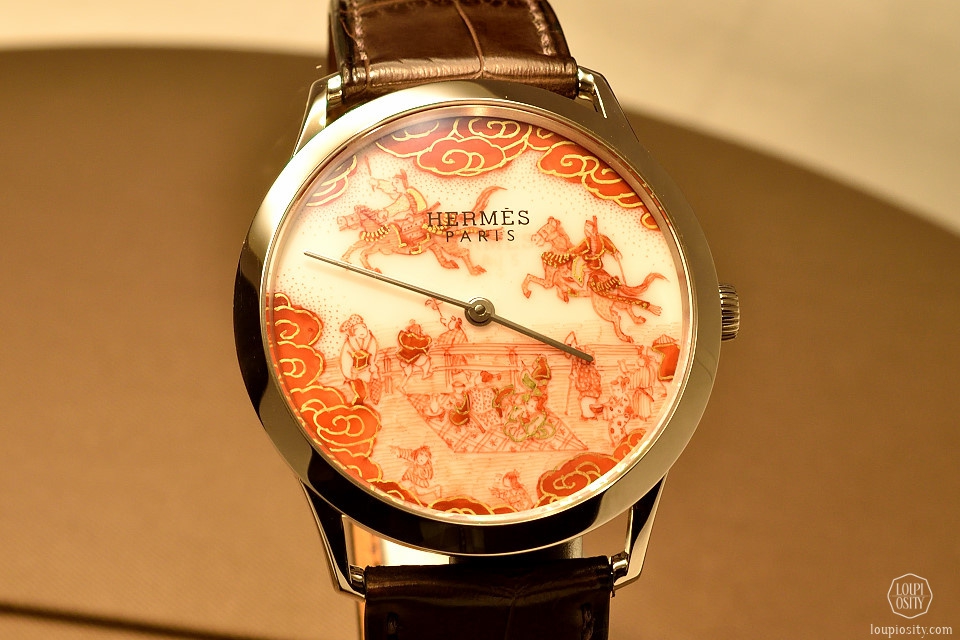
Slim d’Hermès Koma Kurabe
There has been a nice custom at Hermès that employees may travel to different countries to discover new crafts, ancient techniques or just collect inspirations without any commercial goal. If you think of the scarfs of Hermès – the unique pattern they carry are rooted many times in arts of distant lands or done in collaborations with foreign artists. While in Japan on such a tour, Hermès met a master artist of Aka-e painting: Buzan Fukushima during such an inspirational trip. He was born in 1944 and he is a craftsman in Kutani Ware, a traditional handicraft in Ishikawa Prefecture, Japan. He specializes in “Aka-e”.
Aka-e (red painting) and was first produced around 1640. It is a Japanese term for a decoration by enamels on porcelain where the red colour predominates. The Japanese aka-e decoration had its origins in the Chinese wucai five colour over-glaze enamel decorations from the late Ming dynasty periods of Jiajing, Wanli and Tianqi. These enamels were typically dominated by red with the addition of gold, while orange, pale peach, green and black also occurred. There was, on plates, quite often a central circular panel, bearing a basket of flowers, or the Three Friends of Winter (prunus, bamboo and pine), a peach, or a phoenix. Source: Jan-Erik Nilsson
Interpreting the breathtaking patterns to watch dial had many obstacles as Japanese porcelain is extremely fragile and vulnerable. Therefore, the over 300 year-old porcelain manufacturing workshops of Sèvres (near Paris) provided the excellent porcelain base for the art of Buzan Fukushima.
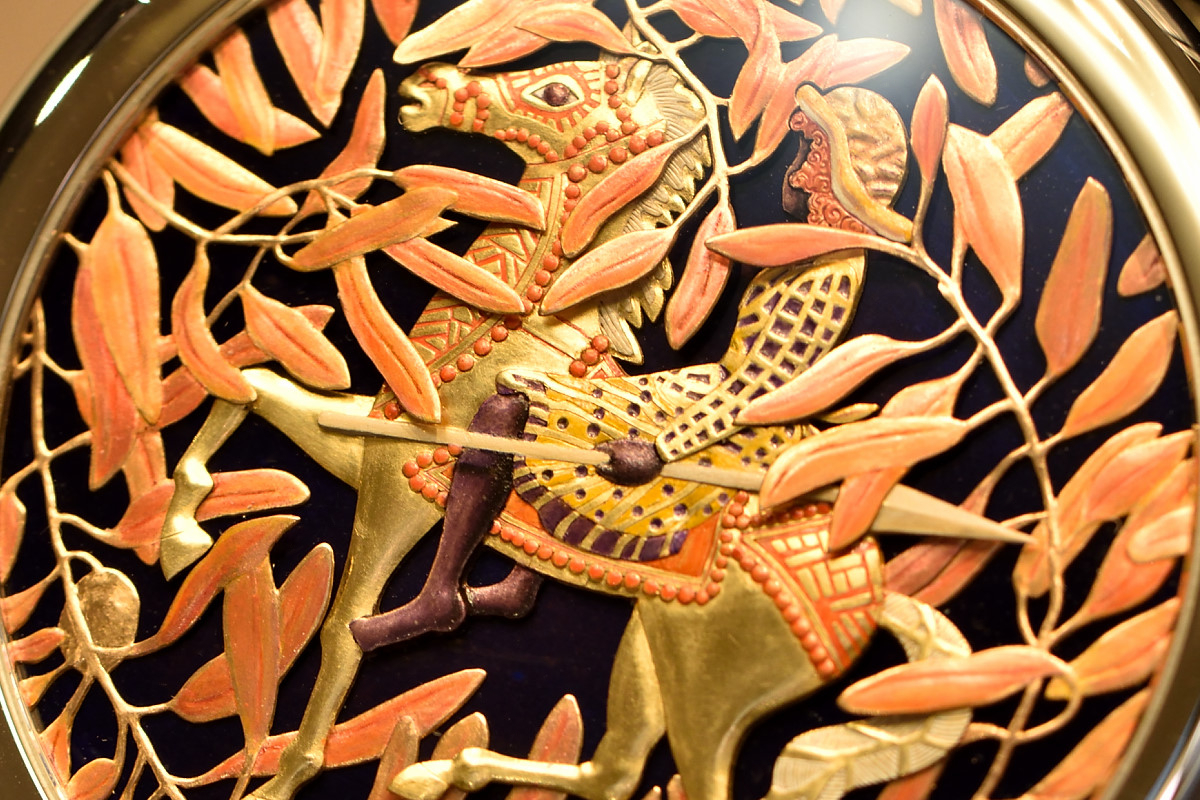
The topic of Mr. Fukushima’s composition Koma Kurabe Uma, the famous Japanese sacred horse race in Kyoto, in the Kamigamo temple, has more than a millennium-old tradition.
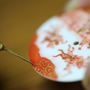
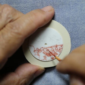
Buzan Fukushima is one of the rare artisans who still exercise the Aka-e technique. He uses extremely fine brushes to create subtly graded shades of red pigment (the main ingredient is red oxide) and ochre, which he coats with a fine layer of gold to complete his work of art. Three firing operations are required to fix the motif. The result is a fantastic white gold timepiece, equipped with ultra-thin Hermès Manufacture movement H1950, and completed with matte havana alligator strap.
Slim d’Hermès Pocket So H and Arceau Pocket Vagues et Coquillages
This year Hermés expanded its series of limited-edition pocket watches with several beautiful pieces.
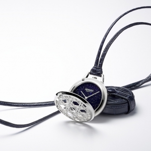
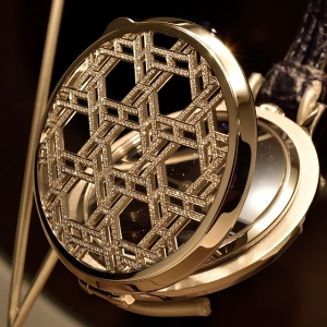
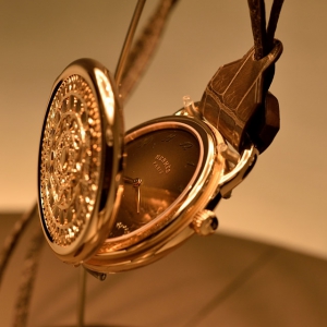
The Slim d’Hermès Pocket So H took the motifs from an Hermès tie created in 1971, while the Vagues et Coquillages (Waves and Shells) motif was initially dreamt up by Pierre Marie for a bath towel.
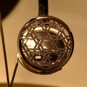
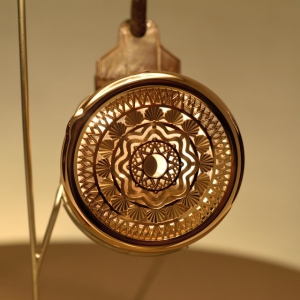
The Pocket So H features different versions: a hawk’s eye dial with pink gold case; an ox-eye dial with gem-set rose gold case; an onyx dial with white gold case; and an aventurine dial with gem-set white gold case. The main focus is on the open-worked cover carefully decorated with the “So H” motif. The composition demands around 45-hours of work for an engraver artisan.
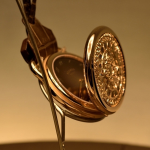
Three unique pieces are in the Arceau Pocket Vagues et Coquillages line. Two of them are crafted in white gold – with a Grand Feu enamel iris or Prussian blue dial – and the third is rose gold with a “Hawk’s eye” toned enamel dial. The shells, the tiny lines the V shapes and the whole lace-like cover require exceptional knowledge, experience and the skilled hands of a master engraver.
Both of the pocket watches house Manufacture Hermès calibres.
Slim d’Hermès Perspective cavalière
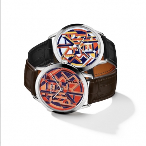
The Slim d’Hermès Perspective cavalière is a typical Hermès piece, easily recognizable from a distance; it is characterized by nice bright colours, interesting colour pairings and geometrical shapes. This pattern was also originally drawn for a silk scarf. The interpretation on the dial of the Slim white gold watch is created by the champlevé enamel technique.
During Champlevé, the moist powder enamel is applied to the engraved patterned metal surface, thus the enamel seeps into the patterns, and it is then fired. During the creation of the base metal pattern, extremely high quality requirements have to be met, because even the smallest unevenness can prevent the appropriate binding of the enamel. When the surface has cooled, it is polished with very fine sandpaper. The un-carved portions of the original surface remain visible as a frame for the colourful enamel designs.
Cape Cod Zebra Pegasus
Do you know how the zebra got wings? Here is the answer. (Normally the Pegasus is a winged divine horse, usually white in colour, a creature from the Greek mythology. He was the symbol of wisdom and fame from the Middle Ages until the Renaissance.)
The Cape Cod Zebra Pegasus watch borrowed the motif from an Hermès silk scarf again designed by Alice Shirley. The zebra is painted on Grand Feu enamel. The essence of the enamel technique is creating transparent and translucent surfaces. Adding various metal oxide powders to the base mixture allows for the creation of a rather rich colour palette. The wings of the Pegasus are enamelled using the cloisonné technique, to give a structure and a special shine to the colourful wings.
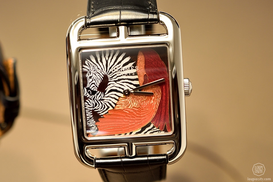

Photo credits: Hermès, Loupiosity.com.
All registered trademarks are property of their respective owners.
All rights reserved.

